Teaching linear perspective is possibly my least favorite thing. It’s so different than almost anything else we do in art class–it’s pretty rare that there’s so clearly a RIGHT WAY TO DO IT and all the other ways are wrong. My file cabinet is stuffed with worksheets and rubrics from probably a dozen variations on perspective projects that I’ve tried over the years, trying to find one that makes me & the students even a little bit happy.
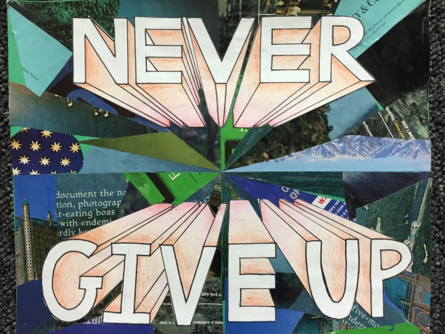
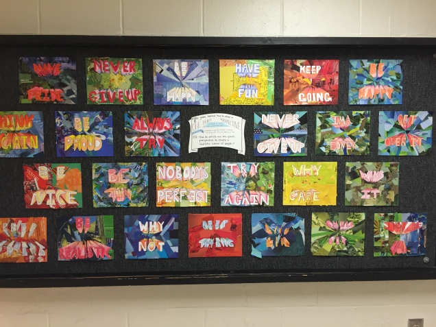
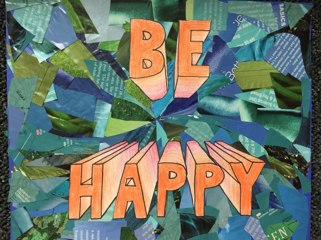
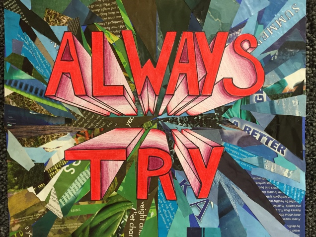
“Never Give Up,” indeed. I hit on this”From My Perspective” project last year, and it remains my favorite way to teach perspective. Drawing block letters in perspective is relatively straightforward, but gives a good grounding in the concept and requires a satisfying amount of spatial reasoning and thinking three-dimensionally.
Plus, hello: a pun! What’s not to like? I have the kids brainstorm ideas for their “perspective on life,” kind of like a life motto. Something they’ve learned in their years on Earth (all twelve of them ;)) that’s shaped the way they see the world.
We actually start these with the backgrounds. We talk about activating negative space with movement and texture, and using analogous colors to create unity and keep it from being too busy. Students establish an overall pattern for the movement in the background with pencil on posterboard, and then fill it in with magazine clippings in the analogous color scheme of their choice.
Then we move on to perspective: learning a brief history of art before and after perspective was developed during the Renaissance, and weird vocabulary like vanishing point and orthogonal line. We do some guided practice, drawing simple boxes before moving on to more complex forms like letters.
Then we do more guided practice.
Then some independent practice in their journals, making a rough draft of their chosen phrase so I can help them correct all those persnickety little details that are so easy to get mixed up.
Finally, they move on to a final draft on white cardstock. There are some very satisfying things about teaching perspective: watching it all suddenly snap into place when a student GETS IT, and that perspective can really appeal to those mathematically-minded left-brained kids who might not always excel in other types of creative pursuit.
When final drawings are ready for color, we learn some design terminology (“color gradient”!) and how to find the complementary analogous colors to those they chose for their backgrounds. We discuss the visual effects produced by complementary colors, and how they’ll really make their letters pop forward, creating strong emphasis.
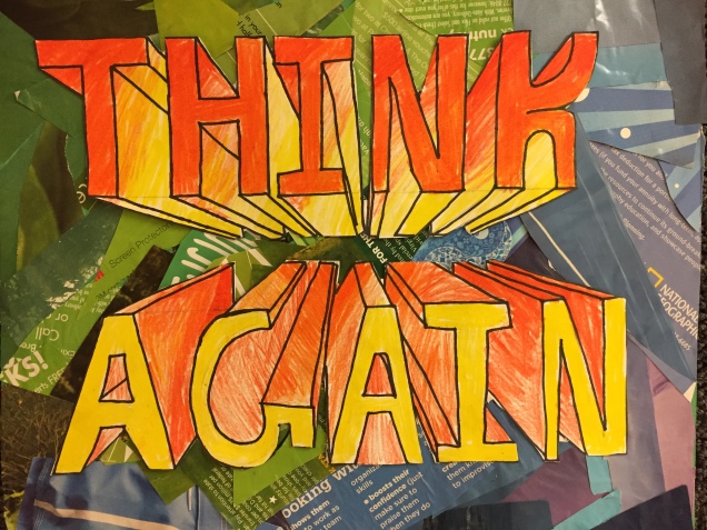
A little precise cutting & gluing, and we’re done! Then we start a nice, huge, instant-gratification kind of painting project as a reward and release from all that tightly focused drawing work. More on that soon!
